The checkout process is one of the most crucial parts of any business. Giving your checkout page the importance it deserves will result in a lower checkout abandonment rate and an optimized checkout experience for your customers.
With the continuous rise of the eCommerce industry, the design of a checkout page is becoming an essential element for conversion. In this article, we give you tips on how to obtain an optimized checkout page and some inspiration with the best checkout design examples of renowned online stores.
What is a checkout page?
A checkout page is the page or pages where a customer lands once the purchase decision has been made. In this stage of the sales cycle process, the buyer needs to input payment information, personal details, or pre-saved payment methods like e-Wallets, PayPal, and Amazon Pay.
A checkout page may be designed in different ways depending on the business, customer profile, payment methods they use, the device they use to purchase, or the shipping methods you offer.
An online checkout is the digital version of the physical checkout counter in any brick-and-mortar store.
Generally speaking, checkout pages are divided into two types: one-page checkouts and multi-page checkouts. Below, we’ll discuss the difference between them as well as their advantages and disadvantages.
Why is it important to have an optimized checkout?
A checkout page that hasn’t been optimized has consequences on checkout abandonment and customer satisfaction.
If you truly want to deliver the best shopping experience and become a customer-oriented business, you have to have an optimized checkout. This includes making it faster and as accessible as possible.
There are many reasons why customers may decide to abandon their cart items. To avoid this situation, implement some of the checkout page best practices shared below to solve the most common points of friction during the checkout process and increase your online sales.
5 checkout page design examples to draw inspiration from
Huel
Huel’s checkout page design is the perfect example of knowing what the customer wants: a fast and easy shopping process that enables them to shop & pay in one single tab.
The buyer can simply add their items to the cart and enjoy an “express checkout” process, or choose to go through a multi-page checkout process, filling out more fields manually.
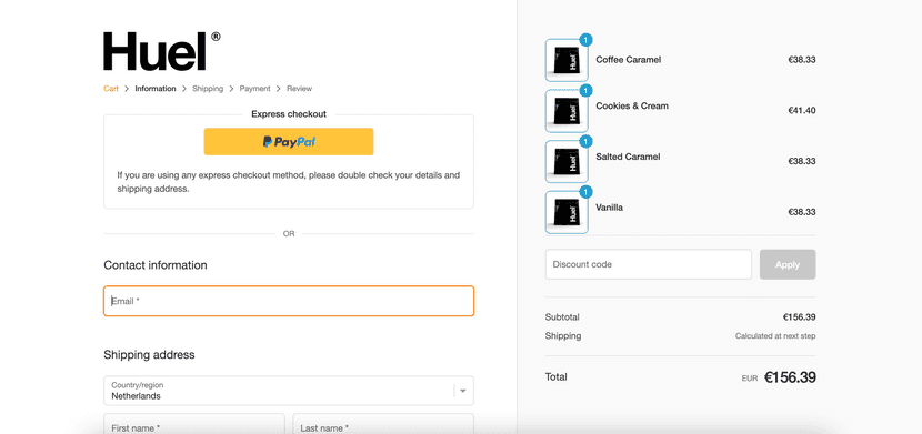
Despite all the fields and components, the overall aesthetic of Huel’s checkout page is quite minimalistic and easy to navigate.
Nike
Nike opted for a multi-page checkout page. However, the colors (or lack thereof) and the minimal fields the buyer needs to fill in make for an easy-to-follow checkout page. It includes all the stages of the checkout in a single page with many tabs, hence the “multi-page checkout” we were mentioning before.
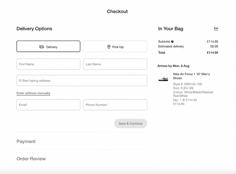
Customers can see, at first glance, what’s in the order, the price and estimated date of delivery, and even choose if they want to have the order delivered (or would prefer to pick it up in-store).
After the personal details are entered, the buyer can go to the next steps to fill out the payment information and review that all the data is correct.
Glossier
Glossier’s checkout process starts at the product page, as you can see in the photo below.
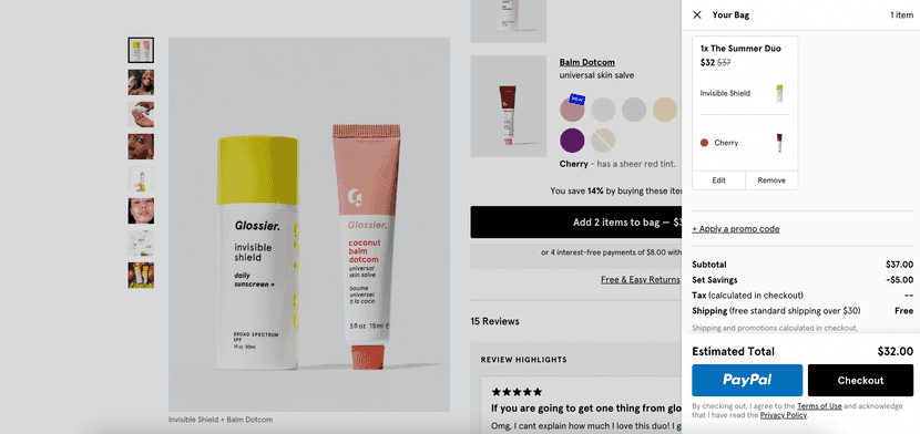
You can either choose to process the order from the product page, where you’ll see the cost of the products, taxes, and shipping costs before you process the order through PayPal (for a faster process), or you can choose to go through a longer process by clicking on the checkout button.
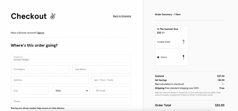
If the buyer chooses to go through the checkout process, there are a few fields to fill out before finalizing their purchase.
Currys
Another great example of an optimized checkout page design is Currys’. From splitting the payment to booking a specific time and hour for the delivery of the order, Currys’ checkout page has thought of the details that make up an amazing purchasing experience.
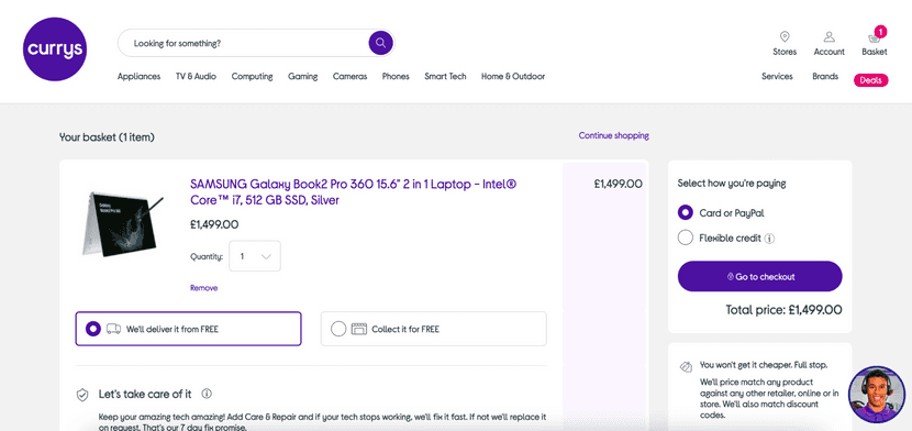
In the first step of the checkout process, the buyer can choose to have the order delivered, or to collect it at a physical store. They can also select how the payment will be made (through card or PayPal, or by splitting the cost in multiple payments). In this section the buyer needs to enter the delivery address to display the options available in the next tab.
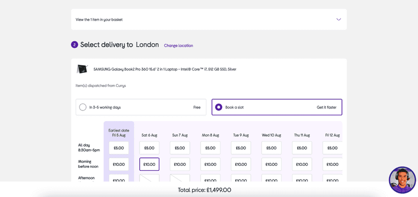
Next, the buyer can choose to have it delivered on a random day and hour or schedule a delivery.
This makes one of the downsides of buying online — the waiting process — more convenient, fostering loyal customers who may decide to get their electronics online every single time.
Pretty Little Thing
This is our last example of a checkout page design that is customer-focused and aligns with the branding of their website.
The pink tones, the banner announcing a discount, and the fact that you can see the original price of the items before the discount are only some of the details that back this up.
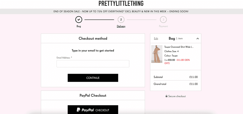
But there are some decisions that stand up in Pretty Little Thing’s checkout page: a progress bar where the customer can clearly see how many steps are left before the order is processed, minimal fields that stand out from the background, a “secure checkout” sign to notify the buyer of the security of the payment, and an express checkout option via PayPal.
One-page checkout vs. multi-page checkout
In this section, we’ll help you decide what the best approach is for your business: a one-page checkout process or a multi-page checkout.
Some online stores even choose to combine both to cater to all the needs and preferences of their buyers.
On the one hand, one-page checkouts are fast and convenient for the buyer. They can see, in one tab, all the information they need to enter, acting as a motivating factor to make the purchase. On the negative side, one-page checkouts are harder to design since they typically need to include several fields without looking cluttered.
Multi-page checkouts can cause friction in the sales process. The reason behind this is simple: after the customer has made the decision to purchase, they will encounter obstacles and more “decisions” to finally buy. Multi-page checkouts are typically used because of a couple of reasons. The first is that they help businesses collect customer data.
For example, if the buyer abandoned the cart after entering an email address, the online store can store this information to later target the buyer, reminding them of an abandoned order.
As an additional benefit, multi-page checkouts are easier to design since the fields can be divided into several pages. This enables UX designers to create a cleaner and more minimalistic checkout page design.
Tip! If you decide to implement a multi-page checkout, display a progress indicator to show how many steps the buyer has left to finish their purchase.
Regardless of what your customers prefer, checkout pages should always be as simple as possible. For this, it’s crucial to remove unnecessary steps and fields, and to apply some of the eCommerce checkout best practices.
If your customers use e-Wallets, PayPal, or Amazon Pay, one-page checkout can be very beneficial to your business. If you sell items with a longer life cycle or a higher price point, multi-page checkouts are a common practice (for example, in the electronics industry).
eCommerce checkout: best practices
1. Mobile-friendly first
The popularization of smartphones has boosted the importance of mobile responsiveness. Mobile commerce is one of the latest (but steadily growing) eCommerce trends.
The prioritization of “mobile-first” by Google, together with the user experience, are two main factors of why you should create a checkout page that is mobile-friendly when designing your store’s checkout page.
But what does mobile-friendly checkout mean? Well, for starters, it needs to have the right dimensions, it needs to load fast, be easy to read and click, and as short as possible to prevent checkout abandonment.
2. Offer different payment methods
One of the main reasons why customers stop processing an order is because they can’t find the payment method they expect, want or need to use. Because of this, enabling all the major payment methods is one of the best strategies to lower your cart abandonment rate and strengthen customer relations thanks to a better purchasing experience.
The payment methods preferred by customers will vary depending on different factors such as age, level of education, country, or even depending on the eCommerce business they are shopping in.
The true benefit is the percentage of successfully finished checkout processes a business will experience compared to those without an optimized checkout page.
3. Create additional discounts and free shipping
Another unpleasant surprise that can hold customers back from making a purchase is encountering additional charges on the checkout page.
This is why all the big players in the eCommerce industry provide free shipping, without losing money. Or, if this isn’t possible, lower shipping costs (that are partially covered in the cost of products).
Being transparent and upfront about any possible shipping costs has been proven to be a smart strategy that will enhance the shopping experience for customers and lower the number of abandoned carts for business owners.
4. Make the paying process ultra-fast
Enabling checkout buttons for popular payment methods or automatically filling out fields thanks to pre-saved information is one of the most efficient ways to reduce frictions in the checkout process. It makes the purchasing experience as easy and fast as possible for the customer.
An ultra-fast checkout page will result in more online sales and happier customers, but soon you will notice the benefits of customer service, too.
To implement these changes, you’ll need to learn which payment methods are the most common among your customers, and find a system to store their profile data.
Conclusions
Coming up with a checkout page design that is attractive for the customer while still collecting all the information you need to process an order and ship it is important.
After reading our section on checkout page best practices and getting inspired by some of the examples we shared, building an optimized checkout experience won’t be such an arduous task.
To further improve your checkout, offer more couriers and shipping options to cater to every customer’s needs without losing money. This can be easily done by using a platform like Outvio.
Outvio connects your online store with dozens of couriers to ship every order. Sign up now and take your post-checkout operations to the next level

